

Summary
For this project, I wanted to create structure and freedom for people who want to explore a creative passion. Dabble is a casual, low-stakes platform on which people can receive daily creative prompts and share their creativity with their friends.
Discovering the Problem
To research the process of cultivating a creative outlet, I interviewed five people who would like to be more creative in their free time. I gained crucial insight into people’s motivations and pains surrounding the development of a creative hobby. I organized their feedback into several categories:
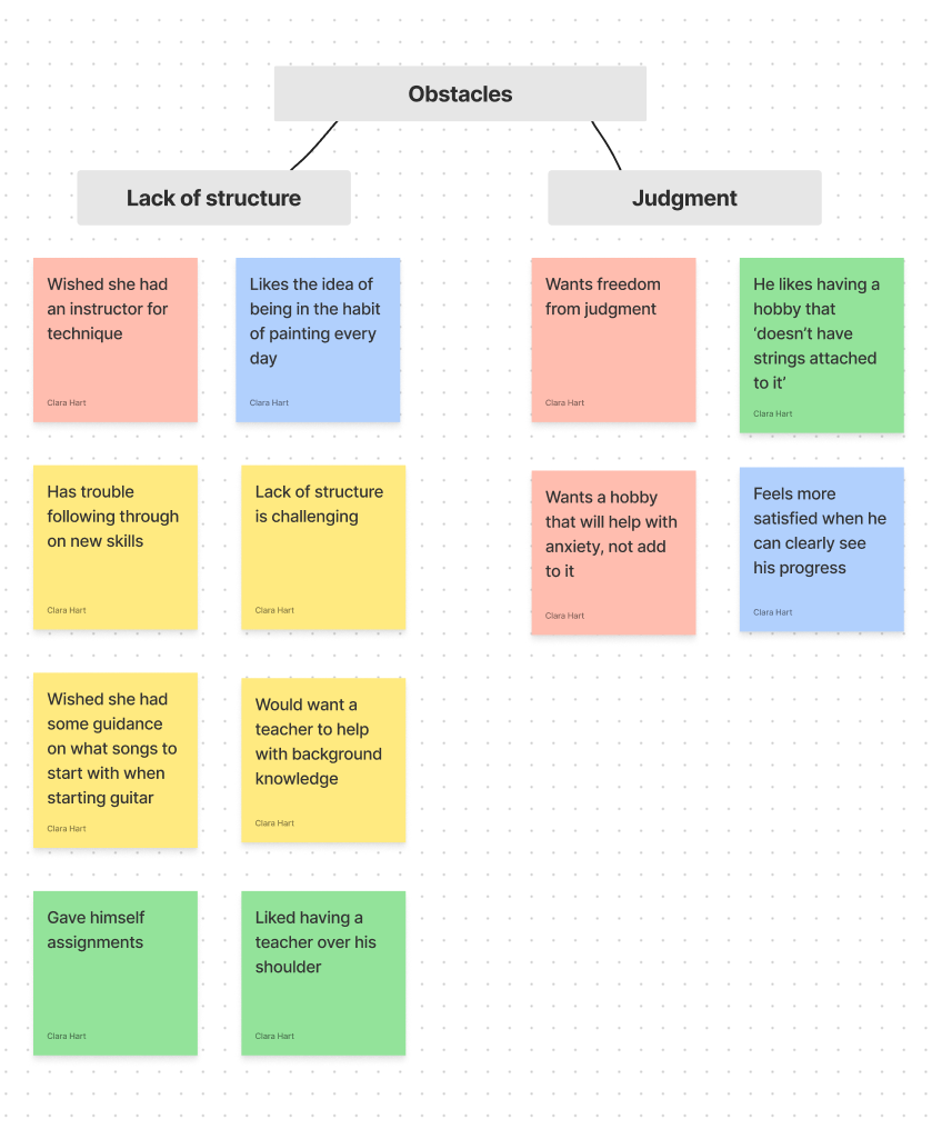

After synthesizing the responses, I identified 3 main roadblocks in maintaining a creative hobby:
lack of structure
self-criticism
worrying about being criticized by other people

How might we help people cultivate a creative outlet with a judgment-free mindset?

Dabble’s solutions to user problems
Problem:
I love the idea of regularly practicing my creative outlet, but I easily fall out of the habit
Solution:
Dabble sends users daily push notifications with inspiring prompts for creative projects to provide structure in the process
Problem:
I want to share my creative projects with my friends, but I get intimidated by platforms like Instagram, where so many amazing artists post their work
Solution:
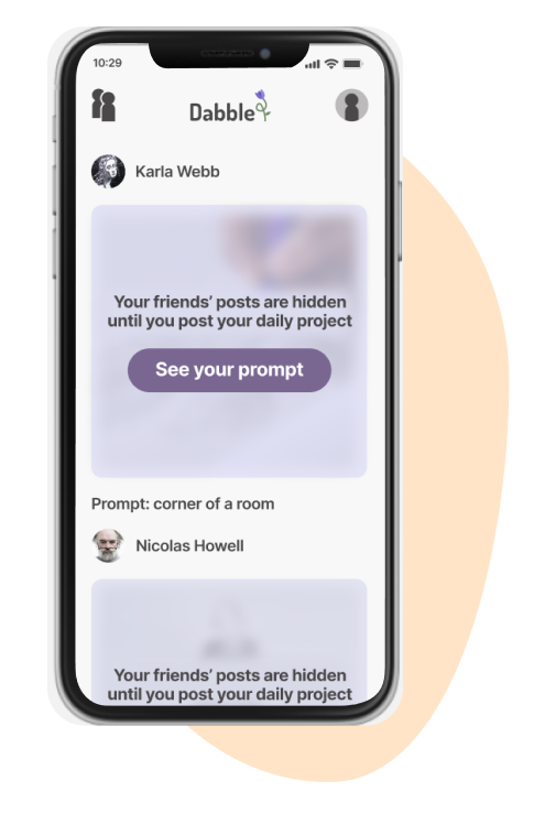
Dabble keeps friends’ posts hidden until the user posts their own project to discourage users from comparing themselves to other creators

Problem:
I get discouraged when I don’t see clear improvement in my creative hobbies
Solution:
Dabble celebrates the accomplishment of creating daily by displaying the days users completed projects on a calendar view. This helps users focus on the act of being creative instead of the end result of their efforts. Past projects are only visible to the user.
How I got to these solutions
Ideation Phase
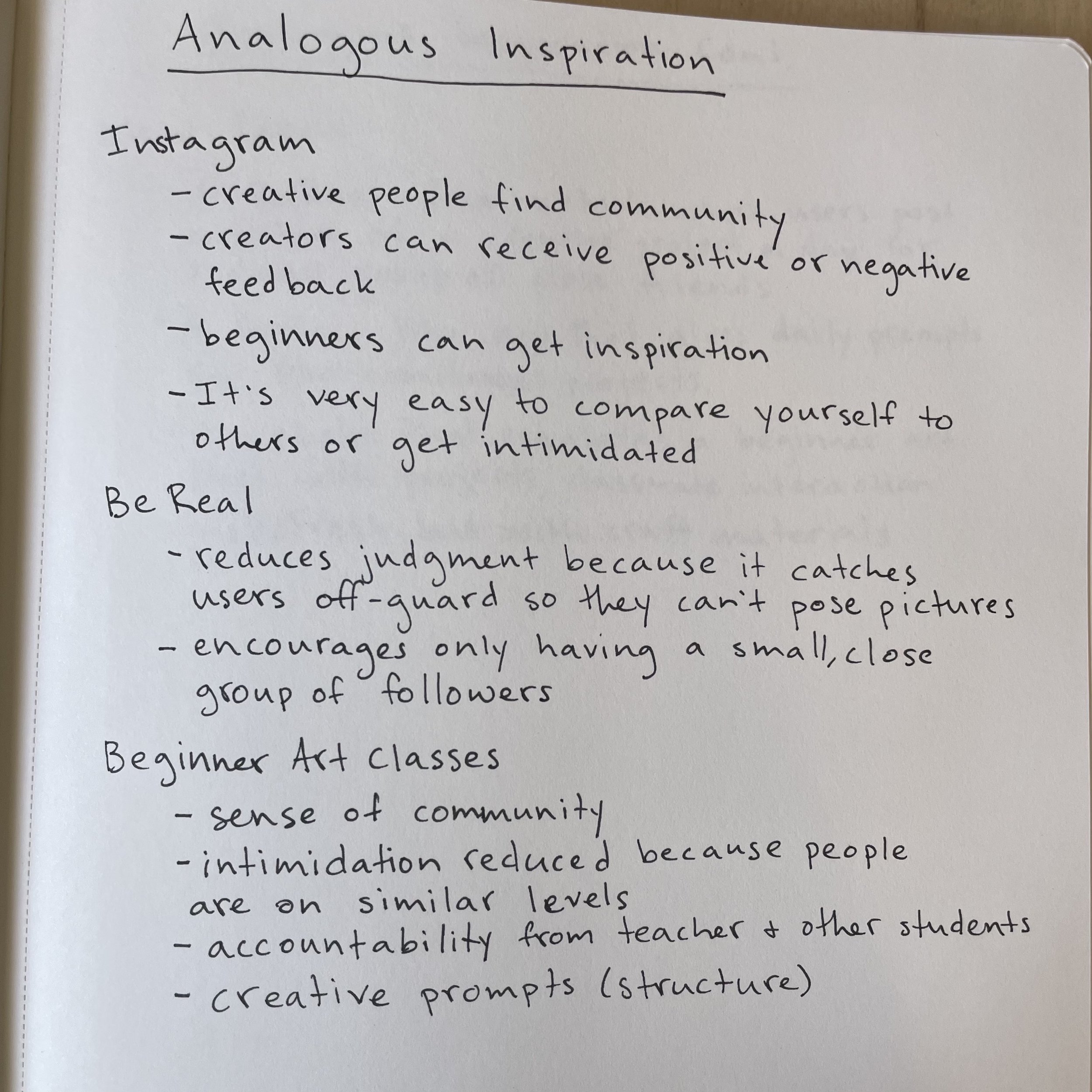
Once I had narrowed in on a problem I wanted to solve, I brainstormed possible solutions with the analogous inspiration method and the bad idea to good idea method.


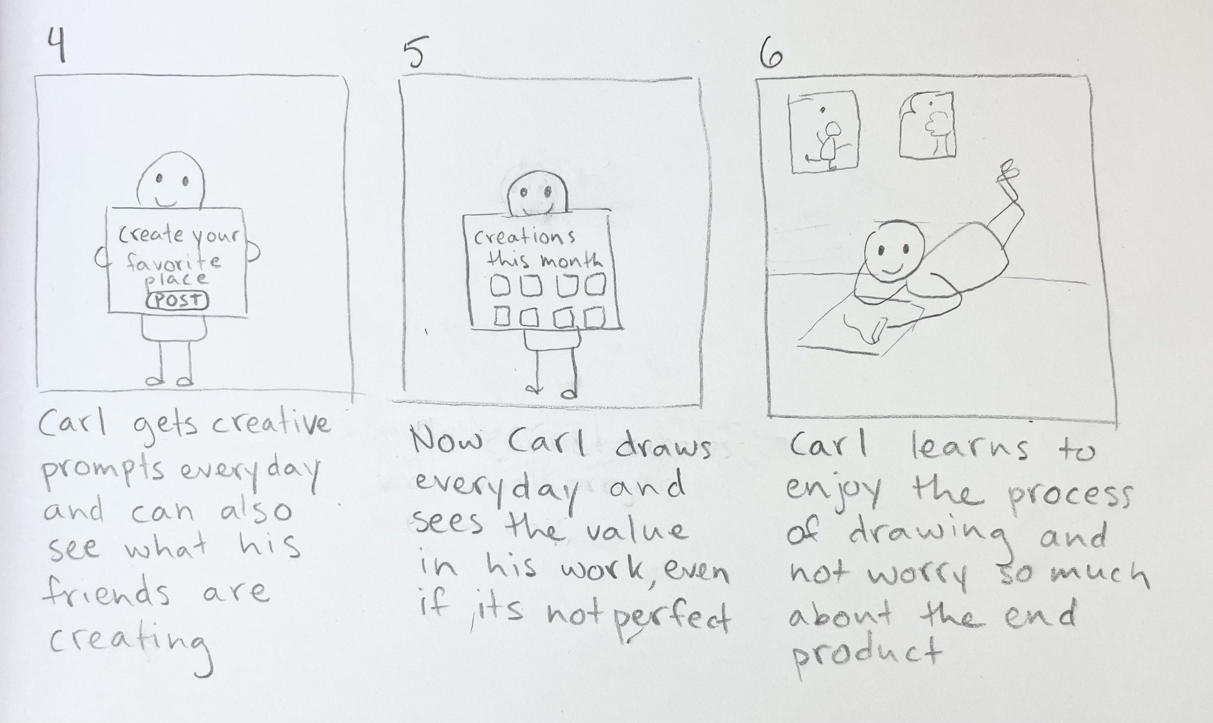
I decided on a direction based on my brainstorming and drew a story board to illustrate how the app could solve user problems.

Competitor Research: Inspiration from BeReal
users are prompted to post daily
users can’t see their friends’ posts until they post themselves
users can only see their own ‘memories’ or past posts
I took inspiration from the BeReal app, specifically how it is set up to create a low-judgment environment for people to freely post what they are up to. BeReal achieves this kind of atmosphere using a few key features:
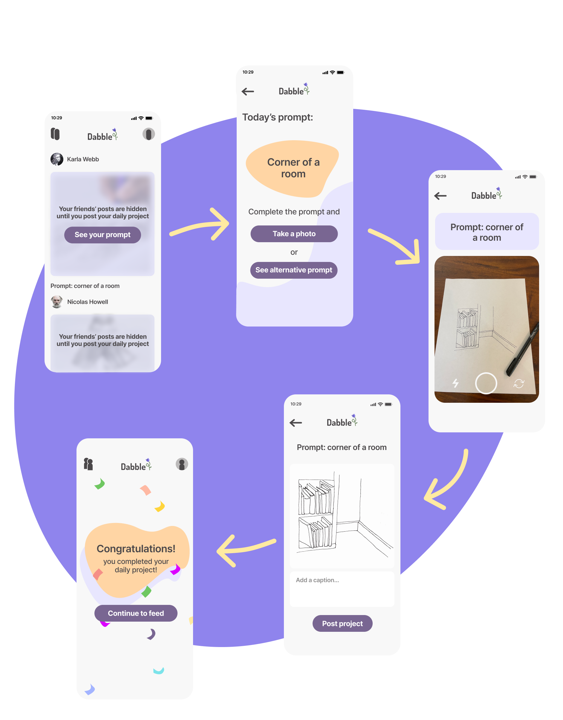
Dabble Post Flow
Dabble follows a similar format, adjusted to inspire users creatively. When a user gets their daily prompt, they complete the short project and post so that they can see what their friends have posted.

Designing the Brand
I wanted the feel of the app to be light and welcoming. I started out with a brighter color palette, but I decided to mute it so that the app wouldn’t clash with the users’ posts.
Challenging My Own Assumptions
During usability testing, some users were a bit confused by the post flow, specifically the screen where their friends’ posts are hidden. I had assumed that since I had modeled the post flow off of the BeReal app, that the process would be intuitive to users. To address this issue, I added in a screen that gives clearer instructions about posting that pops up at the very beginning of the post flow.

Next Steps
If I were to continue with this project, I could see adding in additional features such as the option to choose what type of prompt the user would like to see, and the ability to work on one big project a little each day instead of daily little ones. I would also like to explore how to make the app useful for people interested in a wide variety of mediums, including musical hobbies or things like creative writing.
